Using R & Quandl To Look At Financial Data
Hi there. This page is focused on using R with the Quandl package to look at financial data from the Quandl website.
There is this guide from the Quandl website from getting financial data directly into R. Youtube videos can supplement your learning and understanding with this topic.
You also need your own API key to access Quandl’s database. This can be acquired through signing in.
Installation
In R (or RStudio), install the Quandl package with install.packages("Quandl"). From the code below, I load in Quandl, ggplot2, plotly and dplyr.
# If you need to install Quandl:

# install.packages("Quandl")

# Loading Financial data With Quandl:

library(Quandl)
library(ggplot2)
library(plotly)
library(dplyr)

# Helpful Youtube guide: https://www.youtube.com/watch?v=qg5alOoczNo

# https://www.quandl.com/tools/r
From the Quandl package, you need to tell R that you are using your Quandl API key for authorization. Think of the API key as a password. Quandl’s api_key() function takes in the API key code as the argument.
# Authorization (Set your own API key):

Quandl.api_key("api_key")
For this page, I use the datasets that are free. This link contains estimated median home prices according to Zillow.
To access the data, use the Quandl() function along with the page’s Quandl code (top right corner of page).

### Look at some data:
# Link: https://www.quandl.com/data/ZILLOW/C3821_ZHVITT-Zillow-Home-Value-Index-City-Zillow-Home-Value-Index-Top-Tier-Clarkson-NY

# 1)

clarkson_ny_prices <- Quandl("ZILLOW/C3821_ZHVITT")

# Preview data:

head(clarkson_ny_prices)
## Date Value
## 1 2018-09-30 624100
## 2 2018-08-31 624500
## 3 2018-07-31 621100
## 4 2018-06-30 615300
## 5 2018-05-31 608700
## 6 2018-04-30 602900tail(clarkson_ny_prices)## Date Value
## 265 1996-09-30 293300
## 266 1996-08-31 293300
## 267 1996-07-31 293400
## 268 1996-06-30 293500
## 269 1996-05-31 293300
## 270 1996-04-30 292800# A simple plotly Plot:
plot_ly(data = clarkson_ny_prices, x = ~Date, y = ~Value) %>%
add_lines(y = clarkson_ny_prices$Value) %>%
layout(xaxis = list(title = "\n Date", titlefont = "Courier New, monospace"),
yaxis = list(title = "Price \n",
titlefont = "Courier New, monospace"),
title = "Zillow's Home Value Index For Clarkson, NY \n")
# 2) Platinum Prices From Johnson Matthey Database:

plat_prices <- Quandl("JOHNMATT/PLAT")

head(plat_prices)
## Date Hong Kong 8:30 Hong Kong 14:00 London 09:00 New York 9:30
## 1 2019-12-20 938 938 936 936
## 2 2019-12-19 938 935 931 935
## 3 2019-12-18 929 933 934 932
## 4 2019-12-17 933 935 934 926
## 5 2019-12-16 931 936 937 929
## 6 2019-12-13 947 938 943 933tail(plat_prices)## Date Hong Kong 8:30 Hong Kong 14:00 London 09:00 New York 9:30
## 7054 1992-07-08 NA 385 385 385
## 7055 1992-07-07 NA 386 386 383
## 7056 1992-07-06 NA 385 385 388
## 7057 1992-07-03 NA 385 385 386
## 7058 1992-07-02 NA 386 386 389
## 7059 1992-07-01 NA 379 379 385# Rename columns:
colnames(plat_prices) <- c("Date", "HK_0830", "HK_1400", "LDN_0800", "NY_0930")
# ggplot Lines (Considering all prices/columns)
ggplot(plat_prices, aes(x = Date)) +
geom_line(aes(y = HK_0830), col = "black") +
scale_x_date(date_breaks = "1 year", date_labels = "%h %Y") +
labs(x = "\n Date", y = "Closing Price \n",
title = "\n Platinum Prices \n ") +
theme(plot.title = element_text(hjust = 0.5),
axis.title.x = element_text(face="bold", colour="#FF7A33", size = 12),
axis.title.y = element_text(face="bold", colour="#FF7A33", size = 12),
axis.text.x = element_text(angle = 90, vjust = 0.15, hjust = 1),
panel.grid.major = element_blank()) 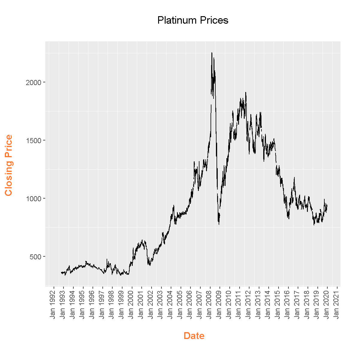
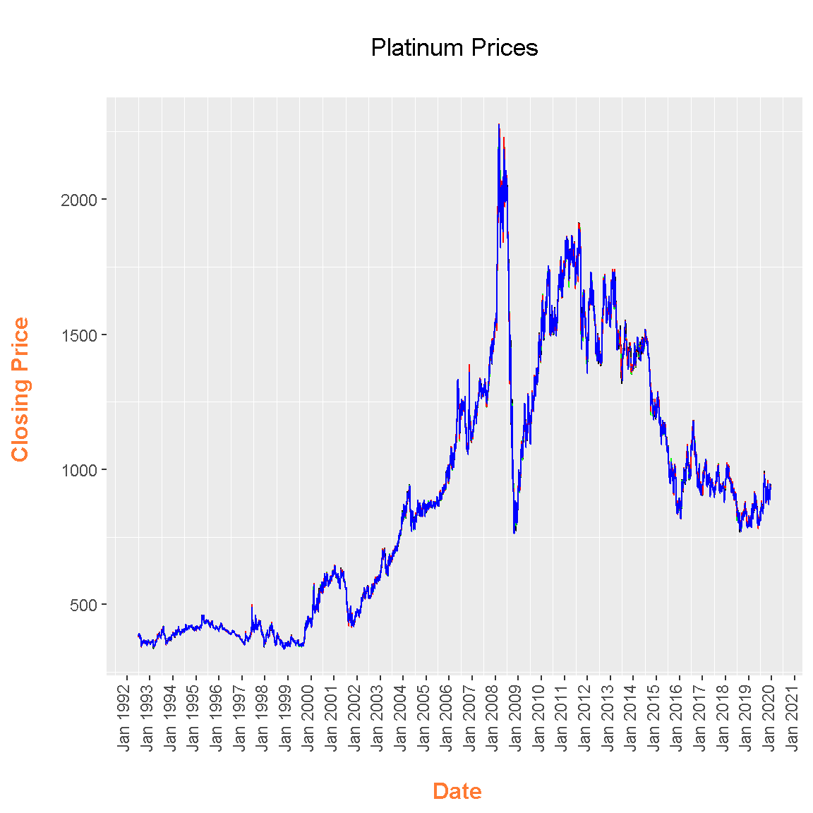
# ggplot Lines (Considering all prices/columns)

ggplot(plat_prices, aes(x = Date)) +
  geom_line(aes(y = HK_0830), col = "black") +
  geom_line(aes(y = HK_1400), col = "green") +
  geom_line(aes(y = LDN_0800), col = "red") +
  geom_line(aes(y = NY_0930), col = "blue") +
  scale_x_date(date_breaks = "1 year", date_labels = "%h %Y") +
  labs(x = "\n Date", y = "Closing Price \n",
       title = "\n Platinum Prices \n ") +
  theme(plot.title = element_text(hjust = 0.5),
        axis.title.x = element_text(face="bold", colour="#FF7A33", size = 12),
        axis.title.y = element_text(face="bold", colour="#FF7A33", size = 12),
        axis.text.x = element_text(angle = 90, vjust = 0.15, hjust = 1),
        panel.grid.major = element_blank())